Packaging Design
Packaging Design
There are two key aspects in packaging design: Physical and Aesthetic.
Orient Design specialises in design aesthetics for packaging, which gives your products the extra edge over competing brands.
A good packaging design is the key to increasing the perceived brand value of your product. It acts as the first tool of communication between consumers and the product. By improving the look and feel of your product packaging, we can shape consumer perceptions and influence their purchase decisions.
Unknown to many, packaging design is also an invaluable form of advertising. It acts as a subtle and unique advertising medium, where customers play a part in increasing brand exposure just by carrying your products. An attractive packaging is eye-catching and creates interest among potential customers.
If you are a small company, packaging design is most likely to be your only and most important form of advertising.
At Orient Design, we have worked with both local and multi-national corporations to strengthen their market positions through enhancing packaging design. Below are case studies of how we have helped our clients improve sales and achieve a strong corporate identity.
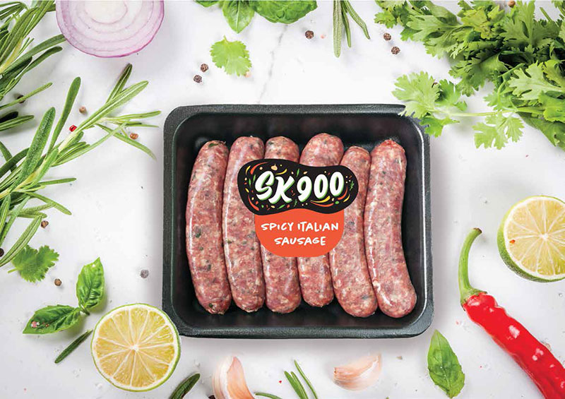
sausages packaging design: SK900
SK900 is a company that specialises in spice-infused gourmet sausages.
With the uniquely shaped logo that brings out the variety of spices used in their products, we placed the gourmet sausages in a black tray to highlight the plentiful ingredients and create a premium feel to the sausage packaging.
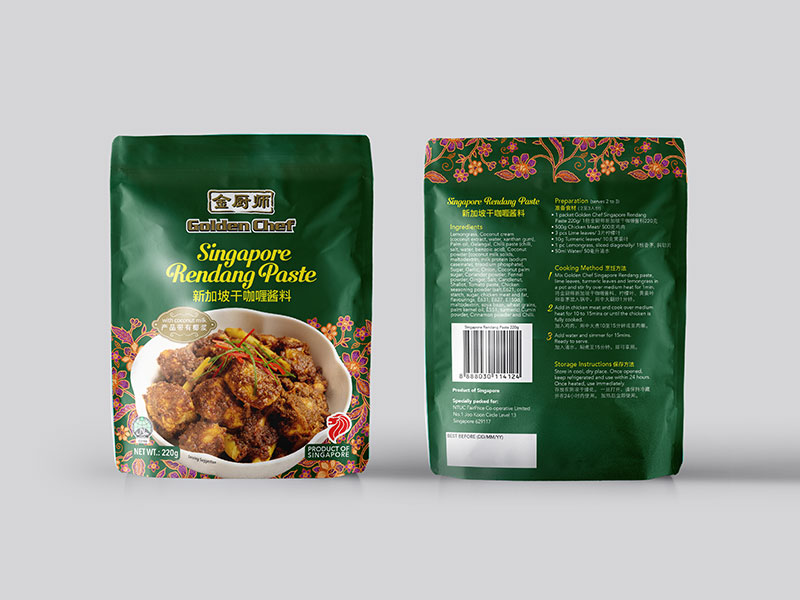
food paste packaging design: Golden Chef
Golden Chef is a household brand that helps families create quality and affordable homemade meals. For this 4-set collection of paste packaging, we aimed to bring out the local flavours of Singapore. With 4 differentiating colour schemes, we placed a distinctive pattern associated with each cuisine’s paste at the base and edge of the packaging, while leaving ample clear space above so the logo is prominent. The bowls housing each delicacy is plain white, to create contrast with the detailed backdrop, while showing off the dish within. Every simple white bowl also has a subtly different lip shape that pays homage to the dishes’ culture. Finally, the title font choice across the collection is decorative yet clear for a beautiful finish.
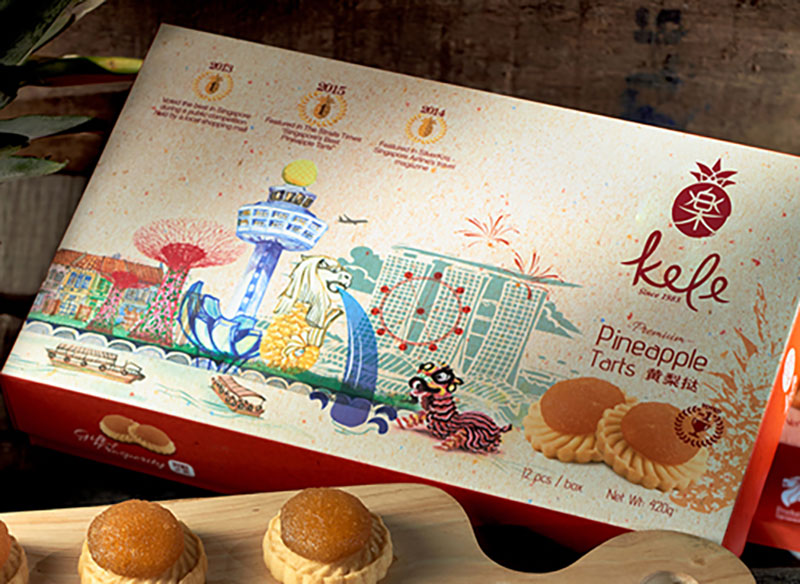
pineapple tart packaging design: Kele
A favourite among local pineapple tart brands in Singapore Kele requested for us to create their souvenir pineapple tart box packaging. We adorned the box with Singapore’s iconic landmarks in a beautiful illustrated collage that weaved seamlessly together with the product. The pineapple tarts are prominently displayed at the front, and individually packed within to maintain freshness.
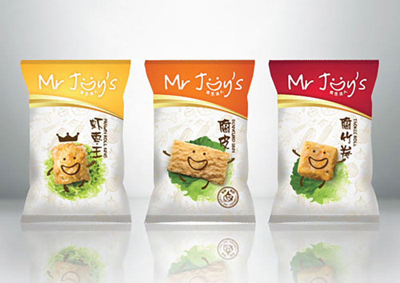
food packaging design: Mr Joy’s
Mr Joy’s strives to craft handmade products that preserves traditional taste for consumers. Instead of the conventional way of simply plating products, we had a fresh take on presentation by playing with the product itself for their roll packaging. We made the products come alive with quirky illustrations, giving plenty of white space around so the product takes centre-stage. This breathed a cheeky, joyful life into Mr Joy’s products, highlighting the personality of the brand and differentiating it from its competitors. It has now become one of the key players in its field.
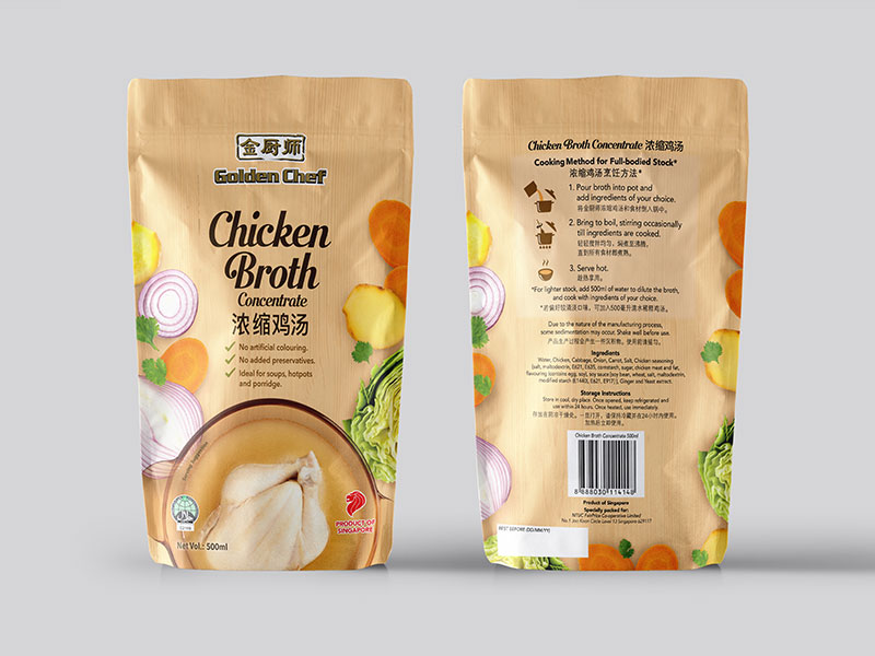
chicken broth packaging design: Golden Chef
Helping families create quality and affordable homemade meals, Golden Chef requested for a new chicken broth packaging design. The ingredients of the rich chicken broth are shown off on the sides of the packaging, while the clear, flavourful broth consumers can enjoy is prominently displayed at the forefront.
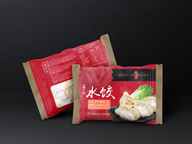
dumplings packaging design: Hand in Hand
Hand in hand desires to bring people together through a common love for food, and requested for us to create their dumpling packaging. The selection of lively, calligraphed mandarin lettering suggests that the dumplings possess a hand-made quality. We placed lightly goldened dumplings on a simple black-lacquer plate to enhance the delicious nature of the product, while also creating an overall superior feel.
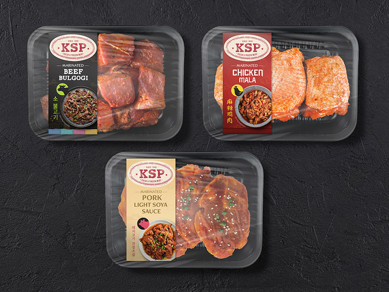
meat packaging design: KSP
One of the leading suppliers of Australian pork and meats in Singapore, KSP tasked us with the packaging for several of their products. We’ve introduced a strong band of colour for each product for easy item identification, and placed it asymmetrically to bring attention to the product behind a clear-film wrapping. We strategically opted for a top-shot of the cooked product, to give consumers a vision of the delectable dishes they can make, while simultaneously suggesting the traditional Korean serving portion for the consumer.
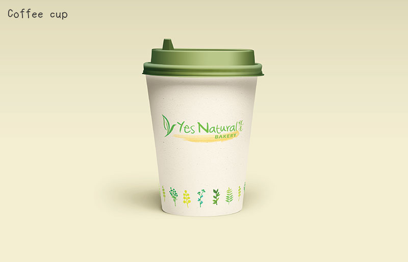
cup packaging design: Yes Natural
Yes Natural is an organic & vegetarian grocery store that also provides eco-friendly household products. Going with the natural narrative, we opted for a cream base for their coffee cup packaging that incorporated water-coloured illustrations of plants to emphasise their down-to-earth personality.
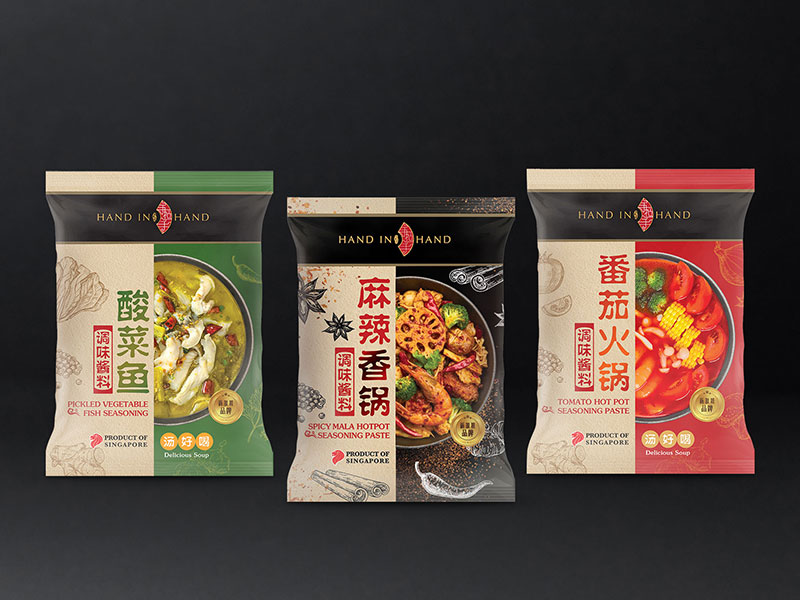
seasoning paste packaging design: Hand in Hand
With the vision to bring people together through a common love for food, Hand in Hand approached us with the task to promote their seasoning pastes. We chose a top-shot of different soup bowls for each paste packet, to show off the ingredients in the paste, and paired it with a half-cut description block complete with a black ribbon for the logo. This configuration creates a distinctive look for the brand, acting as a branding element that could be translated into the rest of its products.
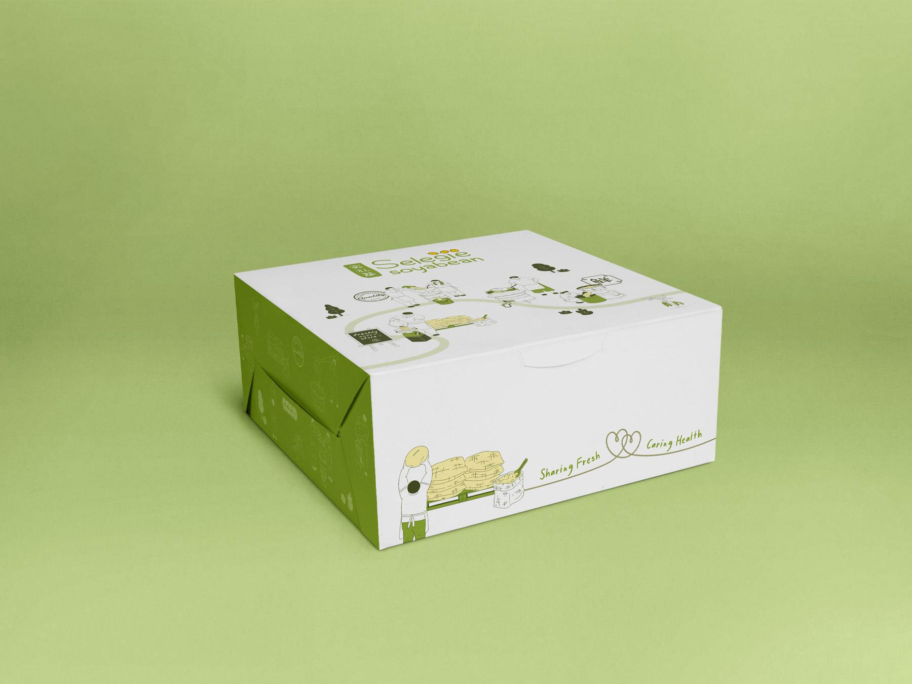
takeaway food packaging design: Selegie Soybean
Selegie Soybean is a household name that strives to produce quality, healthy products as naturally as possible. Using a combination of clean designs and colour blocking, we’ve created a fresh-looking box packaging that illustrates the meticulous process Selegie Soybean goes through to ensure the very best, while expressing their affection and sincerity to their craft and to every customer.
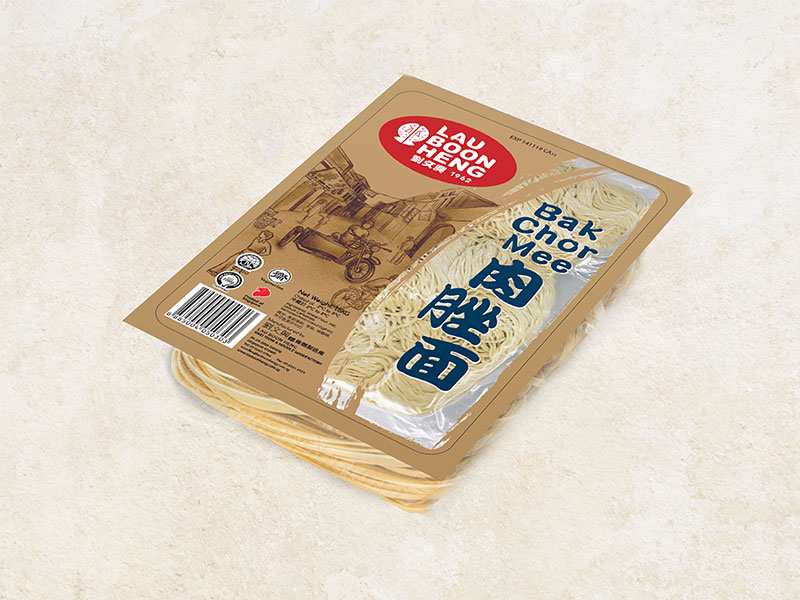
bak chor mee packaging design: Lau Boon Heng
Lau Boon Heng is a pioneering noodle company in machine manufactured Kwei Teow. For their “Bak Chor Mee” noodle packaging, we recalled their first noodle-selling days on a motorcycle in a nostalgic old street illustration. The packaging backdrop mimics rustic kraft paper, which differentiates this packaging from the sterile-looking products in the market, and is also reminiscent of street-sold noodle packaging in the past. Combining the romance of the old and the quality of the new, we further vacuum-packed the noodles to increase its shelf life while showing off the high quality of the noodles.
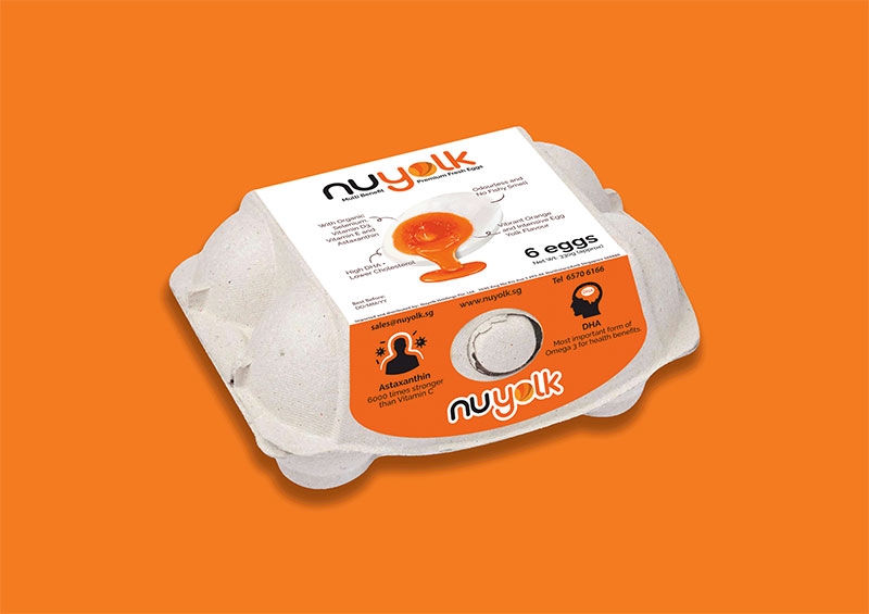
eggs packaging design: Nuyolk
A play on “Nutrition” and “Yolk”, Nuyolk tasked us with creating their basic half-dozen egg carton packaging. We highlighted their unique selling point of nutrition-packed yolks at the top of the packaging, and carefully illustrated their benefits on a prominent half-cut egg. The intentional use of a strong orange at the front of the carton helps to differentiate it from the usual plain-brown of its competitors.
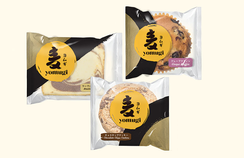
bread packaging design: Yomugi
“Yomugi” is an amalgamation of “Sun” and “Wheat” in Japanese, and we were requested to create their bread packaging. The bold yet clean strokes used on the calligraphed character evokes a premium Japanese quality. The choice of a yellow brush-stroked circle, that was also translated in side-crops on the packaging, recalls the “sun” element of the name. Gold and black was used for the side-cropped elements to further emphasise the superior feel.
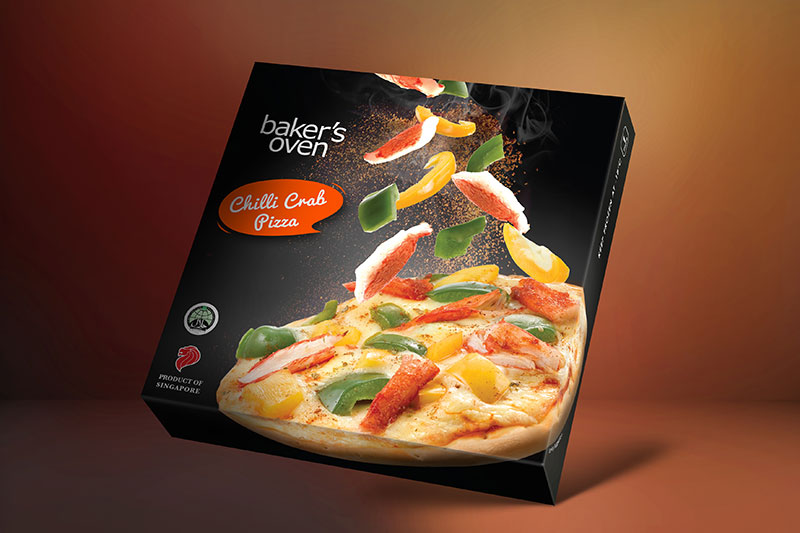
pizza packaging design: Baker’s Oven
Baker’s oven is one of the top manufacturers and a wholesale supplier of frozen baked and confectionery products in Singapore. For their frozen pizza packaging, we intentionally selected a black back-drop with cascading ingredients to highlight their ingredient variety. We also positioned the product in a dynamic tilt, something quite undone in the market. This further differentiates baker’s oven’s product from its competitors.
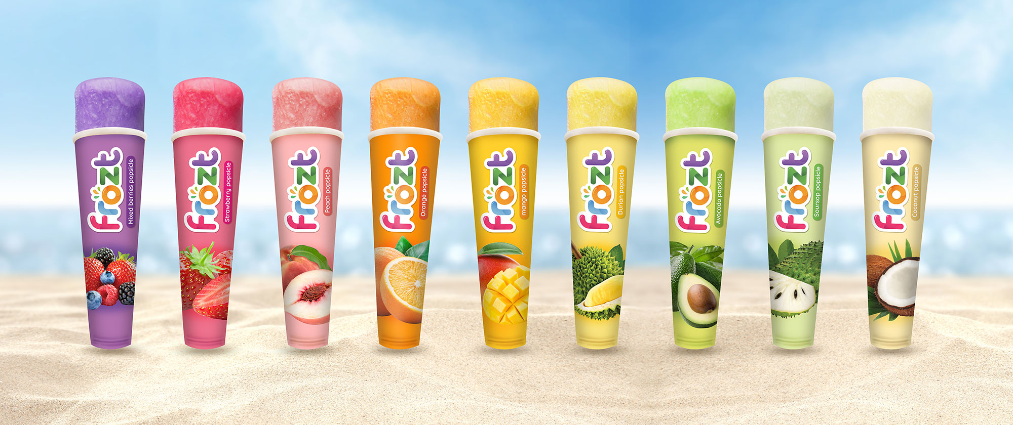
popsicles packaging design: Frozt
A proudly Singapore company, frozt hopes for people to experience the joy of eating healthy popsicles made with real blended fruits. We gave the previously dull popsicle packaging a splash of fresh-looking, bright colours that is both appetizing and fun. It is also an excellent form of colour identification for the consumer. We emphasised the presence of real fruit in the popsicles with juicy, prominent fruit imagery, as if one is biting directly into the fruit itself. We also tried to play our part to protect mother nature by changing the original plastic packaging into a more environmentally friendly paper material option.
food packaging design: New Moon
New Moon is the top canned food brand in Singapore. Its product specialties include abalone, soups and sauces. New Moon wanted a distinctive and contemporary look for its new range of food products. Our challenge was to modernise New Moon’s crescent-shaped logo that has long been a familiar, instantly-recognisable symbol to many.

healthy food packaging design: Earthly Black Garlic
Incorporate with Orient Design to distinguish treasure from mother nature, Earthy Black Garlic. The brand individualised from the components by instead of using plastic, we incorporate the nature touch of rich texture paper. Engaging the innovative technology from Japan, the design absorbed subtle Japanese pattern on transparent container.

bak kwa packaging design: Fragrance
Fragrance foodstuff specialises in manufacturing high quality food brand which maintains fresh taste of natural fragrance for longer period of time. With a wide range of product, Fragrance use orange and yellow to identify their brand on the market. Therefore we synchronise the oranges as part of the product to excite the customer.

cooking oil packaging design: Linda Oil
Linda is one of the familiar cooking oil brand in Singapore market. The company approached us with the a brand update challenge but using purely graphic design without changing current packaging. By studying the market, we introduce Chinese name beside their trademark identity. Green and red are the keys colours, help the whole range unify and stand out at the selling point. Finally, the outcome has been die cut in the shape of an oils drop, reviewing the purity of Linda oils and giving the packaging a hint of dimension.

chicken sausage packaging design: Ballgus Chicken Satay
Ballgus, which means “good” in Malay, is a brand built on quality frozen food. The brand was created with a friendly approach using a smiling face concept. Due to the constraint of the production, we maximise the message on the label by balancing between visual image and information.

raw food label design: Seng Choon Eggs
As a big player in Singapore market, Sheng Choon grades the important of product’s impact at selling points. In order to enhance Sheng Choon Eggs products, we incorporate the brand on the side view. The information is precisely displayed, giving our customer the best understand of the products quality.

can food packaging design: Hosen Condense Milk
Hock Seng, one of can food distributor leader, creates Hosen condense milk for Singapore market. By understand the important of selling point impact to Hosen, we differentiate them by inject and celebrate the green and fresh feeling of the milk cow farm. Illustration is the key visual creates a modern feeling, help Hosen standout on the shelf.

barbecued meat and floss products packaging design: New Peng Hiang
New Ping Hiang is a B to B company targets oversea trade. The packaging design contain a tourist identity with topical design to represent SIngapore, using strong red to recall the happiness in Chinese New Year.

ice cream packaging design: Gelato Roma
Gelato Roma is a new brand of ice cream coming to Singapore with the concept of Italian ice cream cart. Orient Design takes part in final artwork adaptation and prepare the design for a young, vibrant market in Singapore.

rice packaging design: Paddy King rice package set
Paddy King is the key product of leading rice importers and exporters in Singapore, Hong Lian Gim Kee. Joining the dynamic rice market, Hong Lian Gim Kee introduces a new range of rice, including Basmati rice and imported origin from USA. Orient Design is challenged to upgrade their long history brand and combine new products without distracting exiting range.

sauce packaging design: Chng Kee’s sauces
offers a wide range of pre-mixed sauces for consumers, and for supply to major airlines, international fast-food chains, hotels and restaurants. For their products in DFS outlets, our task was to create a novel packaging design which would appeal to tourists and stand out from competing brands on store shelves. We decided on a Peranakan building to represent Singapore’s diverse culture. For the other packaging (as shown on the left), we injected a water-coloured look to bring out the feel of the good old days in Singapore. Besides its aesthetic appeal, the packaging is also functional –folding into a piggy bank, so customers could keep it after consumption.

cooking sauce packaging design: Prima Taste
authentic asia sauce. From a modest flour miller, Prima has grown into a prominent player in the Singapore food and bakery industry. For their line of ready-to-cook sauces, we enhanced the oriental feel by incorporating visual elements like chopsticks and bamboo steamer prints. We also gave each of the flavours a distinct colour and enlarged the visual of the featured dish on the packaging, to create a focal point and a more captivating feel.

food packaging design: Shi Le Po
Part of the Singapore Food Group, Shi Le Po produces and sells local food products. To help the brand express its vibrant, local identity, we used bold colours for its corporate logo. For its packaging, we kept to complementary colours of green and red, combined with vivid visuals for memorable product representation.

soy sauce packaging design: Tai Hua soy sauce
Considered one of Asia’s top brands, Tai Hua Food consistently provides consumers with a wide selection of traditional sauces made from premium, natural ingredients. We polished the Tai Hua logo by making the English words more distinct, with a wide, bold font. This complements the original style of the Tai Hua Chinese characters. A red hue was added to the logo, to convey a warm, homey feeling suitable for food brands.

food brand design: Liang Pin
An established distributor of dry goods with years of experience under their belt, a key objective of the logo makeover was to create an updated image while retaining its traditional appeal. The logo takes the form of a stamp, conventionally known as a symbol of acknowledgement and approval. Coupled with the brand’s name, Liang Pin, which in Mandarin, carries a connotation of superiority in rank and quality, the logo delivers a message of premium quality goods.

honey packaging design: Yummi House
active wild honey. The special edition of Yummi House Active Wild Honey is made memorable and unique with the concept of enjoying premium wild honey from the comforts of home. Foil matt finish gives the packaging a texture akin to the tree bark, drawing the consumer into the illusion of entering the forest with the opening of the packaging.


dim sum packaging design: Yum Cha
is an award-winning Dim Sum restaurant located in the heart of Chinatown in Singapore. Its original logo was dull and dated, so our task was to rejuvenate their corporate identity. Using the literal meaning of the term ‘yum cha’ (which means drinking tea), we incorporated visual elements of a teapot and oriental colours like maroon and chrome, to give the brand a traditional look and feel. For their takeaway boxes, we printed bamboo textures onto the background to represent Chinese steamers, which are synonymous with Dim Sum delicacies.

pastry packaging design: Tong Heng
Chinese confectionary is well-known for its tasty, traditional pastries. We designed its logo to resemble a Chinese seal, to allow for easy brand recognition. Tong Heng also uses confectionary boxes for festive and wedding occasions. We used deep gold and red shades for the boxes to portray a premium image for the brand. On the shop front, we modernised the interior by printing Chinese tales of traditional pastries on glass.

nougat packaging design: GB Nougat
Golden Boronia nougats initially planned to have the entire brand name spelt out on their packaging packs. However, we worked with them to revise this approach. It was felt that the abbreviated version, GB, would make for easier brand recognition in the international market. We gave the logo vivid colours, and produced new images of the nougats. The new packaging has a transparent portion in the shape of nougats, to make the product appear more appealing to consumers.

dried food packaging design: Chef dried food
The revamped design marries a touch of modernity and freshness with original flavour of the brand. The illustration is simplified and complemented by the banner in a deep shade of royal red, which adds an air of prestige. The end result is a polished, updated look that appeals to new consumers while retaining its familiarity for the existing consumer base.

cookie packaging design: Mama’s Oven
The Cookies Factory is a premier cookies and biscuits manufacturer with more than 20 years experience in crafting exquisite products. We collaborated to created Mama’s Oven, celebrate Madam Lim’s traditional recipe since 1971. Started by incorporating visual elements of cookie mould into Mama’s Oven identity, we bring back the kitchen feeling and created a distinguished pattern for the brand. Using a warm and homey tone of color from the graphic elements to container, Mama’s Oven packaging is designed uniformly, helping the brand share the family delicious treat.

crackers packaging design: Kracker King
Kracker King is a popular snack brand that aims to become “The Asian snack that the world snacks on”. We have revamped their snack packaging with the intension of breaking the typical traditional appearance of local snacks, using a more modern approach with striking primary colours and clear illustrations. This increased their brand awareness greatly as Kracker King snacks now stand out among other brands in the shelves, helping them to attract more customers and increase sales in a short span of time. Kracker King has become a renowned brand among Singaporeans as it is prominent in the local snack market and will continue to be successful in the years to come.

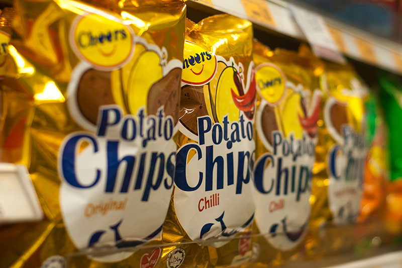
potato chips packaging design: Cheers
The epitome of convenience, house brand Cheers familiar to all Singaporeans had a mini revamp where we helped to extend their brand logo identity and packaging. We enhanced their logo and products by adding a smiley face to portray friendliness in hopes of relating to their customers. The consistent metallic gold background across all their potato chips packaging helped to catch the customers’ attention when placed in the shelf beside competitors. It also has strong illustrations to differentiate clearly between the various flavours, which will aid in product recognition and hopefully leading to customers gaining trust in the brand.
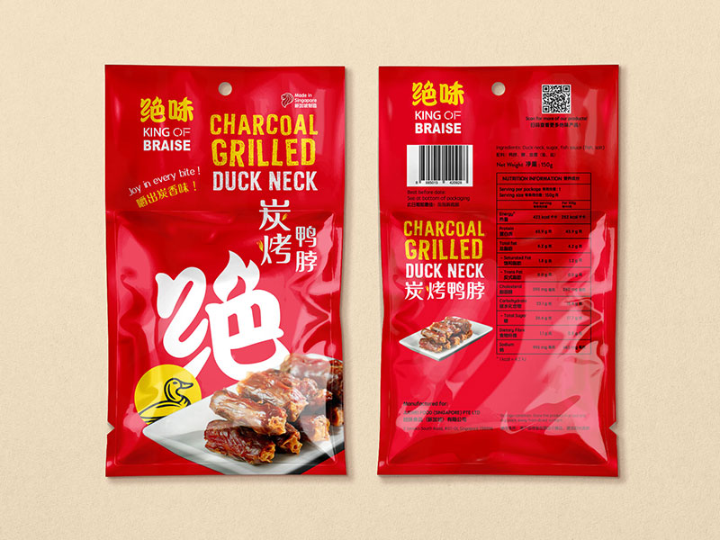
charcoal grilled duck neck packaging design: King of Braise
King of Braise needed a strong packaging for their new product, grilled duck neck. We opted for an eye-catching background where the bold metallic red will catch the attention of potential customers. We made use of the logo’s strong typography by enlarging it and making it a mini window, for curious customers who would like to catch a glimpse of the product inside. The product photography portrayed the duck neck beautifully, capturing the essence of the smokey grilled exterior and its succulent texture. This packaging set this product apart from its competitors thanks to its easily-recognizable logo and outstanding finishing.
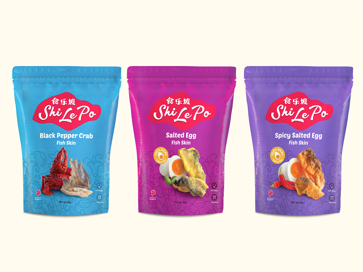
fish skin snacks packaging design: Shi Le Po
Fish skin snacks are increasingly popular these days, but what makes Shi Le Po stand out is their range of local flavours that other brands are lacking. We used photographs of the product to showcase and promote how crispy and fresh the fish skin snack is. The batik textures in the background represents and links back to the long history of the Singaporean brand, while the unique background colours serve as flavour identification and differentiation. Not forgetting the metallic finish that leaves a strong impression when customers see it in shelves, as it reflects light beautifully and catches the right attention.
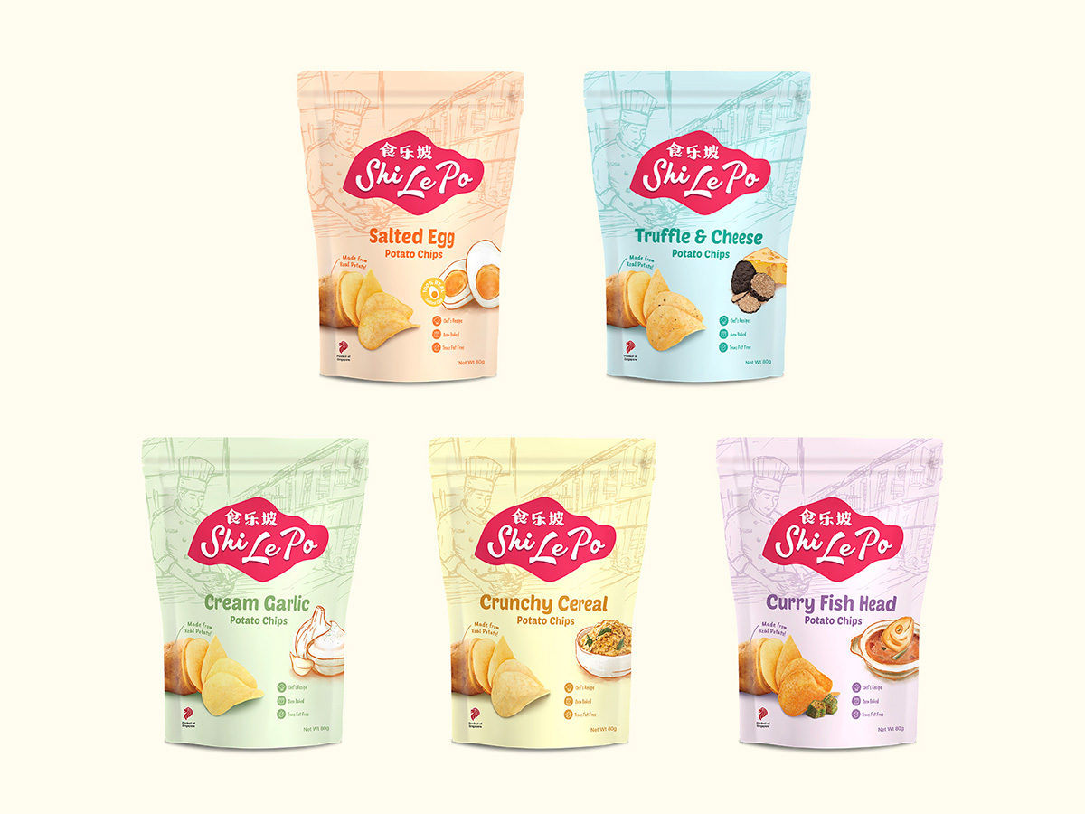
potato chips packaging design: Shi Le Po
Home-grown snack brand Shi Le Po tasked us to design a packaging that strongly conveys their rich history, origin and believes. We added the silhouette of the Singapore map as part of their logo to represent its authentic and local roots. Promoting their unique selling point that the snack is made with real potatos, we added a clear visual of the chips together with an illustration of the various flavours. In the background, the detailed line drawing of the chef highlights that their signature recipes are indeed their very own. Finally, the wide range of background colours differentiates each unique flavour from each other and the matte finish enhances the final look.
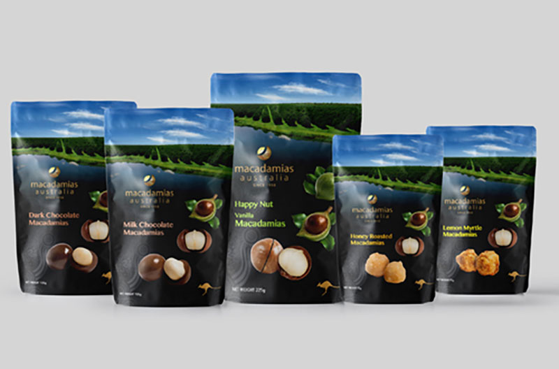
macadamia packaging design: Macadamias Australia
Being one of the top macadamia suppliers in the down under, Macadamias Australia tasked us to design their packaging for the international market while preserving their strong Australian endorsement and identity. Their beautiful natural farm takes the spotlight on the top of the packaging, portraying the sustainable and clean process of their home-grown macadamias from start to finish. The subtle tribal patterns in the background pays respect to the indigenous groups as the traditional owners of the land upon which Macadamias Australia stands. Finally, the matte finishing of the packaging adds a soft yet luxurious touch which sets them apart from other brands and attracts customers.
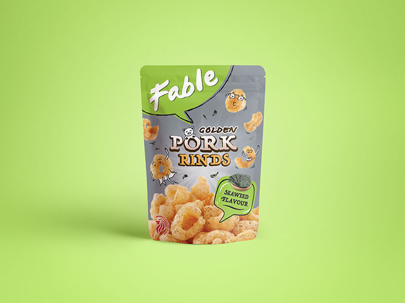
pork rinds packaging design: Fable
Fable’s Golden Pork Rinds is an unusual and delicious snack. We approached the design of this packaging in a different angle, where the illustrations give the snack a fun element. The unconventional placement of the brand logo at the top left of the packaging is unique and highlights the brand Fable, when placed among competitors. If you look closely, the lines in the background gives a subtle zoom effect which captures customers’ attention and lures their eyes to focus on the product name
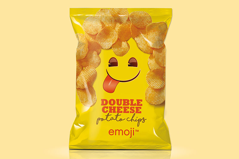
potato chips packaging design: Mama’s Oven
In this new day and age, emojis are very common and are used everywhere. In this packaging, we broke through the original circle outline of emojis and created its unique personality by combining the facial expression with the potato chips. This way, the character of the emojis stand out in shelves together with the bright yellow background and interesting typography treatment in the product name. The combination of bold block letters and a more comfortable and laid-back script font creates an eye-catching contrast.
cracker chips packaging design: Uca
As The Tai Sun strives to provide customer the best of quality, the brand creates a new choice of snacks, Uca unique tapioca crackers. We introduce Uca display the crackers from the side view, embraced the thin and crunchy bite of tapioca. Finally, tapioca benefits are written on top, creates energetic and cheerful peck to Uca.

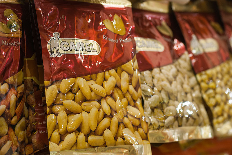
snack packaging design: Camel Peanuts
Camel is one of the top-selling brands for nuts products under Seng Hua Hng, which prides itself in product innovation and quality. To rejuvenate the brand’s look, we introduced shades of orange to create depth to the packaging. The re-design of Camel’s packaging also factored in functional aspects, and this eventually led to a reduction of their inventory costs. We also widened the transparent portion and added an orange bar at the bottom of the packet, so the peanuts are better framed and look more appealing to consumers.
coffee capsule packaging design: Arrow Coffee
Arrow Coffee developed a range of premium coffee capsules which are compatible with all Nespresso® machines and are for everyone to enjoy. Tasked with designing their coffee box packaging, we married a luxurious colour palette with a minimalist layout that gave a clean yet classy look. The design channeled the classic English style with an ornately illustrated arrow placed subtly in the background, pointing skyward to new heights. With the logo positioned prominently at the top with a gorgeous gold-foil stamp effect, and the descriptions in an elegant uppercase serif font, this design oozes an undeniable old-school charm that is hard to miss.

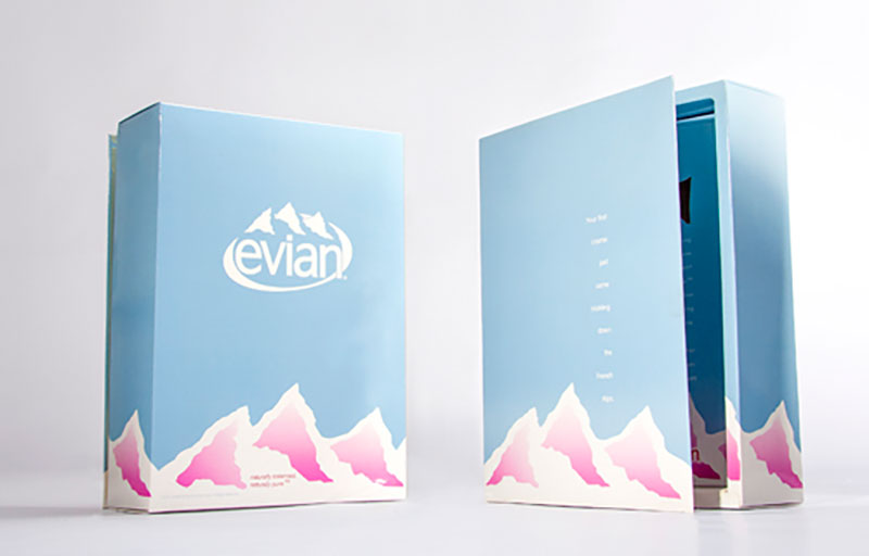
mineral water packaging design: Evian
Evian is a brand of luxury mineral water from France. For their special limited edition mailer box packaging, we incorporated their trademark rolling alps mountains into the design of the box, with ample space on the horizon so that the logo can shine through with prominence. The mountains were given a delicate fuchsia tint, the secondary colour palette of evian, to strengthen brand recognition and create a light, refreshing look.
cocktail packaging design: Raffles Hotel Singapore Sling package
Made as a souvenir set for Raffles hotel, this souvenir box packaging was for a set of miniature Singapore Slings. The illustration on the front is of two gentlemen enjoying a leisurely drink at Long Bar, the birthplace of the first Singapore Sling, which is still in Raffles Hotel to this day. The box is sized with the bottles in such a way that it mimics how the cartons of wine were packaged. We chose a rustic, browned paper material that retained the courser texture of vintage parcels for a nostalgic feel. Great pains were taken to employ the services of a traditional letterpress printer and use original letterpress technology, so that we may achieve the authentic printed effect of that era.

water bottle packaging design: Life bottle
A prominent product in Singapore market, Life water has always be synonymous with quality at affordable prices. We remained the iconic deep blue of the brand with a touch in detail.Orient Design also recreated Life packaging using symbol represent the cycle of water, recall customer about the green source and fresh quality of Life.

mineral water bottle packaging design: Pere Ocean mineral water
A Singapore-owned company, Pere Ocean was a pioneer in the local bulk bottled water and cooler rental industry. The company decided to refresh its brand when sales started sliding. We carried out field studies for Pere Ocean, and uncovered the main problem: its bottles did not stand out on the store shelves. We designed their logo to resemble ocean waves and gave it a 3-dimensional look. Lifestyle illustrations were added on the translucent bottle sleeve, to inject an avant-garde feel.

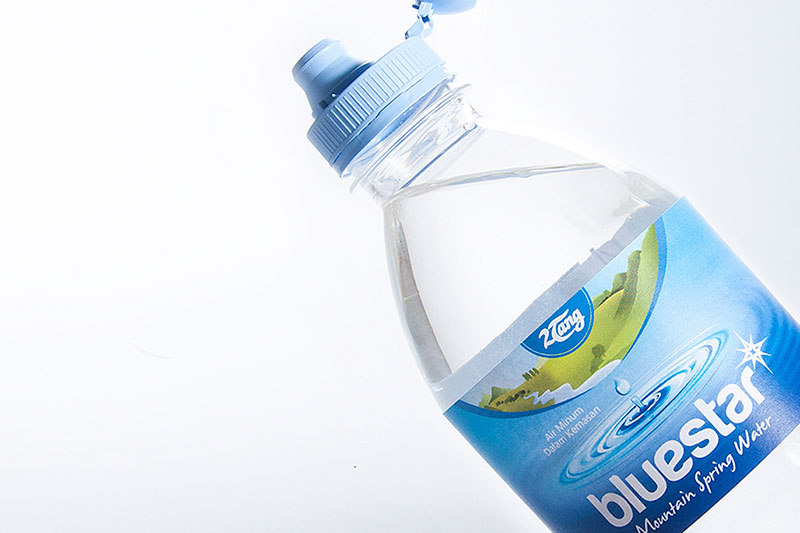
mineral water packaging design: Blue Star mineral water
Formerly 2dang, the Indonesian brand has transformed into Blue Star after a complete brand makeover. The hallmark of Blue Star is water that is bottled from springs and Earth’s natural underground foundations. With this unique selling point in mind, the concept of spring water flowing seemingly directly into the bottle for the label design was born. Coupled with the new bottle design featuring the user-friendly ‘flip cap,’ Blue Star, which has an easily recognisable name, achieves a strong brand differentiation that has contributed to an increase in awareness and sales.

water packaging design: Evian
Evian is a brand of luxury mineral water from France. As a special press kit, we designed the packaging with the target to adapt Evian Identity and spirit in minimalism and elegant but young and vibrant.

alcohol label design: Walton Whisky label
Walton Whiskey was inspired by Walton street, the Oxford long history street, to introduce distilled British beverage to Asian. The whiskey label design encountered the imperial touch by adopt the emblem shape and the royal horse in the key visual. We also bring back the delicate type design from the 18th century on gold foil printing technique.

beverage packaging design: Bochile wine
Mapuches- a native Indian tribe ,that still lives in Southern Chile, fought against the Spanish conquerors for 300 years between the XVIth and XIXth centuries. This great achievement has been possible thanks to a treasure and one of Chile’s best kept secret: the “Maqui” berry superfruit, provide the Mapuches the needed vitality, strength and wisdom to fight the conquerors. Bochile was created to share with the world the story of Maquches tribe and Chile pleasure gem.

Vietnamese coffee packaging design: Umixx coffee
Umixx was created to express Vietnamese coffee rich essence to global consumer. We started from focusing on define the unique brand name by using sharp curve and well-crafted identity design. Through studying Vietnam coffee culture, we adapt glass cup into main visual to differentiate the brand from the market. Icon of Vietnam country scene and national flag were casted on Umixx packaging to enhance recall of product origin.

coffee packaging design: Mac coffee
Russian leading instant coffee brand, MacCoffee, launched a new strong range: Max 3in1. In order to distinguist Mac coffee from competitor, we carefully studied Russian market and came up with an unusual angel shoot of the coffee cup. Inspired by the drinking coffee experiences, we capture a vertical shoot of a coffee cup, reflecting MacCoffee’s rich aroma and premium quality. The outcome create a strong visual impact, helping Max 3in1 the number one spot year after year in Russian coffee lovers.

tea packaging design: Gold Kili red date tea
Gold Kili embodies over two decades of great tasting instant beverages. In design packaging for Gold Kili, celebrating traditional tea is our top priority. Gold texture material helps us demonstrate the tradition with a touch of premium. The cup shape enhance the identity of the product on shelf, but also remind us the old style joy of Chinese tea.

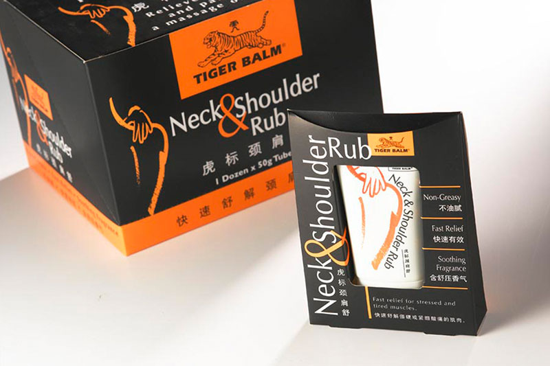
pharmaceutical packaging design: Tiger Balm ointment
A popular brand worldwide, Tiger Balm ointment and its product extensions are renowned for invigorating the body and soothing body aches effectively. For its neck and shoulder rub, we designed a retail pack which provided our Client with a structured solution for display and warehousing. Black was used as the main colour to give the product a modern and sophisticated look, while complementing the brand’s trademark orange shade.

pharmaceutical packaging design: Guardian
As a giant retail chain in Singapore, Guardian is firmly positioned as a pharmacy with beauty and health brand. The key challenge was for their house-brand of products to compete with established brands. We kept to a clean, basic style for the packaging, using focused shots of the limbs to create a better visual impact. We took Guardian’s corporate navy blue and added shades to give the packaging a 3-dimensional look.

pharmaceutical packaging design: First Choice plasters
Part of Dairy Farm group, First Choice is a trusted brand in Singapore market. The new packaging for plaster series is designed to synchronize with the whole brand identity. By integrating with the main visual, the design simply speak up the function of each range, create a clean and friendly feeling.

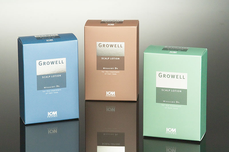
scalp lotion packaging design: ICM Pharma lotion
Growell is a new Scalp Lotion elaborated by ICM, one of the largest local pharmaceutical manufactures in Singapore. The packaging, however, developed differently from clinical look of other range. We shaped a more premium feeling for the design by minimise use of graphic elements. Finally, silver hot sampling gives the whole design a prime touch and attracting look.

traditional Chinese medicine packaging design: Eu Yan Sang
is an established and reputable healthcare brand with core focus on Traditional Chinese Medicine products and services. To reinforce its credible image ad international standing, we added a contrasting white bar at the top of the packaging. The box was designed to resemble a Chinese practitioner’s book of herbs. These two design features serve to create a modern look and feel for the brand, without compromising on the product’s Chinese oriental roots.

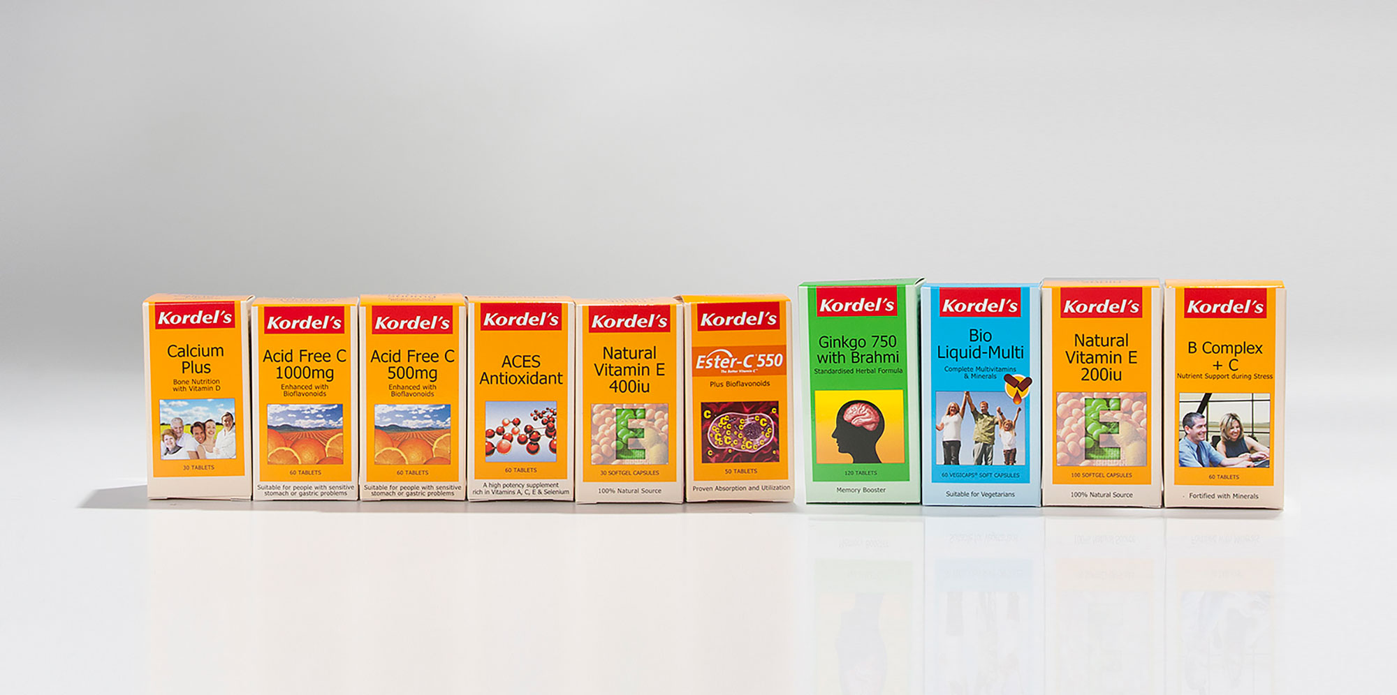
supplements packaging design: Kordel
Kordel’s brand is based upon a bold red banner, allowing it to be more noticeable and stand out from the rest of their packaging. As they produce a wide range of supplements to suit customers’ health needs, we used various striking colours to categorise the functions. Apart from the product name, the strong graphics in illustration style is impactful and aids in easy recognition for customers to repurchase when they need to.
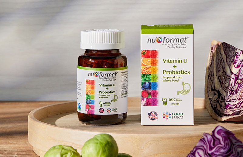
vitamins product packaging design: Nu-Format
Derived from natural whole foods and vegetables, Nu-Format organically cultivates vitamins to enhance your heath in the most natural way. Nu-Format’s logo contains a colourful circle with a human figure in the middle, which signifies a beautiful and healthy life that their products bring to customers. The solid apple green bar at the top aids in easy identification when customers are shopping, leading to a strong brand recall. The kidney icon that is strategically placed in the middle of the packaging helps customers to identify different ranges of supplements within the brand. Lastly, the Made in USA and Food Form logos enhances Nu-Format’s credibility and gains trust from their customers.
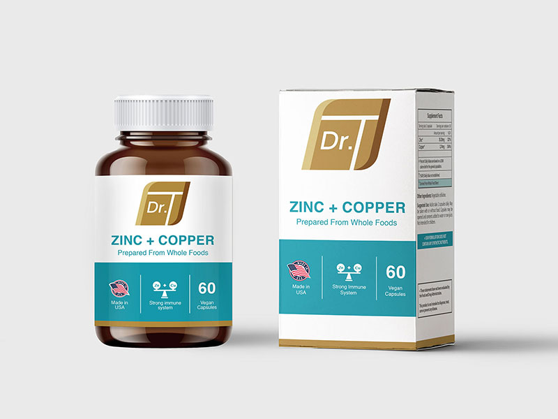
supplements packaging design: Dr. TNu-Format
Dr. T supplements packaging has a clinical approach, formed by a systematic colour usage of brown tones and teal. There is also ample white space around the logo, which directs attention to it. The product name is spelled out with a straightforward font, paired with a simple but outstanding banner to highlight key functions of the supplement. Within the range of supplements, individual products have different banner colours for consumers’ easy differentiation.
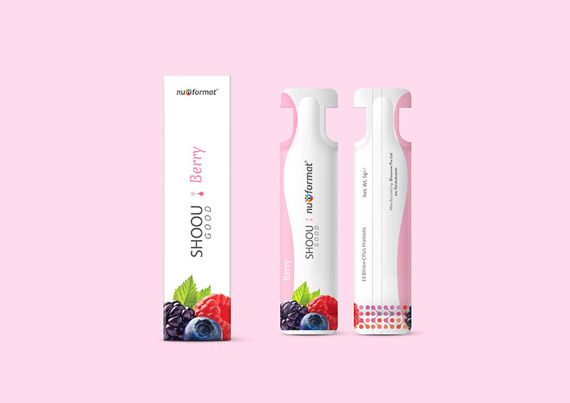
enzyme product packaging design: Nu-Format
Under Nu-Format, Shoou is an enzyme product that aids in slimming. The individual sachet packaging has graphics at the sides which symbolize the curves of a women’s body, emphasizing their target audience. The bright and attractive photographs of the fruits communicates to customers that the produwhile enhancing the overall visual of the sachet. Towards the top half of the sachet, there is ample breathing space catered to help the brand stand out and be more prominent despite its small size. Lastly, the packaging box is unique as it extends backwards in terms of length, to portray the slim feeling in the front panel. This small change is simple yet effective in promoting Shoou as a product of Nu-Format to customers.
health supplement packaging design: Kordel’s packages
Kordel’s is one of the leading health food supplier for a wide range of food and nutritional supplements. We comprehend each category and use green, yellow and orange colour to differentiate them. Vivid key visual create a strong impact, yet consistency throughout the whole range.

health supplement packaging design: Redoxon
Redoxon is the worldwide famous brand under Bayer. As the brand makes way to Asia market, Orient Design cooperage to help Redoxon localise the full range. Our challenge was to ascertaining the consistency of packaging production quality.

ginseng supplement packaging design: Avalon american ginseng slice
is a health and beauty brand which harnesses technological innovation in the manufacturing of its products. The Avalon American Ginseng Slice needed a modern look for its packaging, without sacrificing its origin as a form of Chinese medicine. We gave the box packaging a white outline with a square identity, to convey a clean and young image for the brand. A ginseng silhouette imprinted in the background gives consumers a better understanding of the product, without compromising on the packaging’s aesthetic form.

health supplement packaging design: BorschMed lingzhi powder capsules
is a leading provider of Traditional Chinese Medicine supplements. Their products can be consumed on-the-go, to meet the demands of today’s busy working professionals. To give the brand a premium positioning, we gave the packaging a gold band and subtly dusted gold paper, to bring out brand’s Chinese roots. The picture of the linzhi is deliberately made less obvious, to enhance the brand’s premium image.

vitamin packaging design: Unity Singapore
In a market saturated with competing brands, the challenge of this exercise was to give Unity a simple, straightforward, yet distinctive look that was immediately identifiable with the Unity brand. The result is an eye-catching colour scheme on the packaging that gives the brand a fresh and vibrant image, giving the products a leading edge when it comes to differentiation from the competition.

bird’s nest packaging design: Yummi House bird’s nest
Yummi House Bird’s Nest packaging comes in a beautifully crafted box with gold finish, befitting its premium nature. Designs of white batik can be found throughout the packaging, symbolising the elements of nature in an aesthetically pleasing manner. Packaging for the 100g Bird’s Nest is conceptualised in a similar creative vein, with a see-through turn-able cap on an understated UV varnish. This look gives the product a refreshingly different viewing dimension.

bird’s nest bottle packaging design: Eu Yan Sang bird’s nest
Eu Yan Sang is a long history traditional Chinese Medicine global healthcare company, with a modern scientific perspective. The brand allows oversea customer to benefit from their product with their convinience mini bird nest. Our execution lays on suggesting customer enjoy one easy teaspoon of bird nest everyday. And for the background, we recall the traditional by using a soft blurred chinese calligraphy background, yet keeping an overall elegant and premium look of Eu Yan Sang brand.

bird’s nest packaging design: Dragon Brand bird’s nest
is a member of the Kim Heng Group, Dragon Brand is the leading premium brand of bird’s nest in Singapore. Following requests from its customers, Dragon Brand decided to launch its new line of mini bird’s nest bottles packaged in the form of a gift box. We developed an adjustable internal nesting for the box, to give flexibility for packing combinations of normal and smaller-sized bottles. Rich gold was used as the dominant colour scheme, to make the gift box appropriate for any occasion – even during festivities like Christmas and the Lunar New Year.

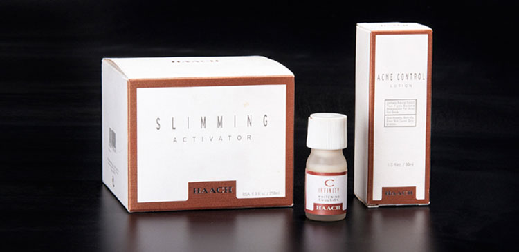
cosmetic packaging design: Haach
As a touch of the classic quality for nature beauty, Haach cosmetic packaging used coper metallic matt print on texture paper. The brand became more subtle as the logo get smaller and labeled at the bottom, give space for the product present. This design brings out Haach elegant beauty and the brand exquisite quality.
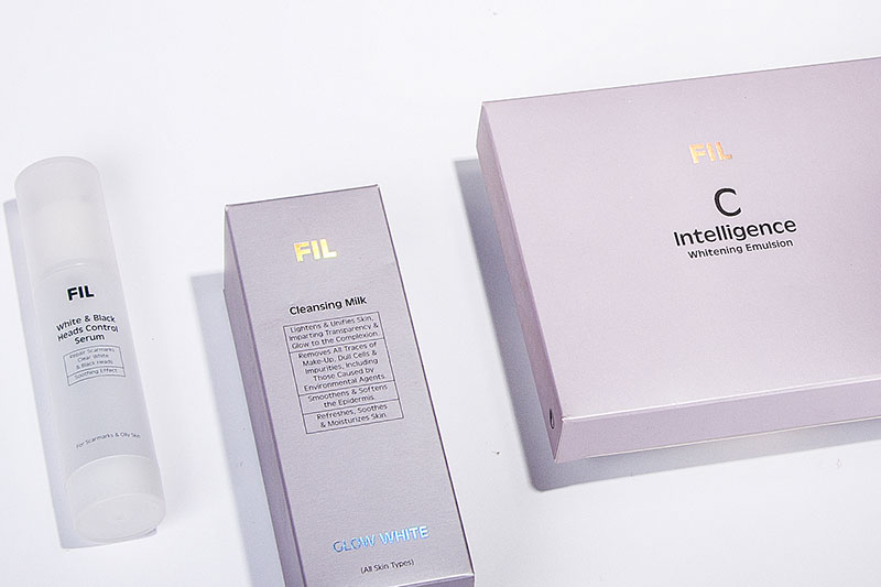
facial cosmetic packaging design: FIL facial product
Fil is the house brand of Haach beauty salon, targeting the hi-end market. The packaging celebrate simplicity using foil paper which reflect light purple matching the sense. The logo created using laser foil reflect different hint of color, create a modern dynamic touch within a simple design.

clinical cosmetic packaging design: Skin Matrix
is a line of clinical skincare products targeted at medical professionals and dermatologists. In designing SkinMatrix’s packaging, we therefore created a minimalist look, with comprehensive product description. We added small but significant touches, such as different colours and typography in the interior of the box. Overall, this gave the product a modern and refreshing look and feel.

cosmetic packaging design: Bellewave skincare
is a prestigious brand for skincare and cosmetics. As a local brand aspiring to build an international reputation, our design had to reinforce BelleWave’s image of being technologically forward. To achieve this, we gave the products a sleek metallic finish, with comprehensive product descriptions. Clean and simple fonts were used for the typography to convey a sophisticated feel. Additionally, we proposed using different colours to differentiate the various product families under BelleWave, while maintaining a consistent design style.

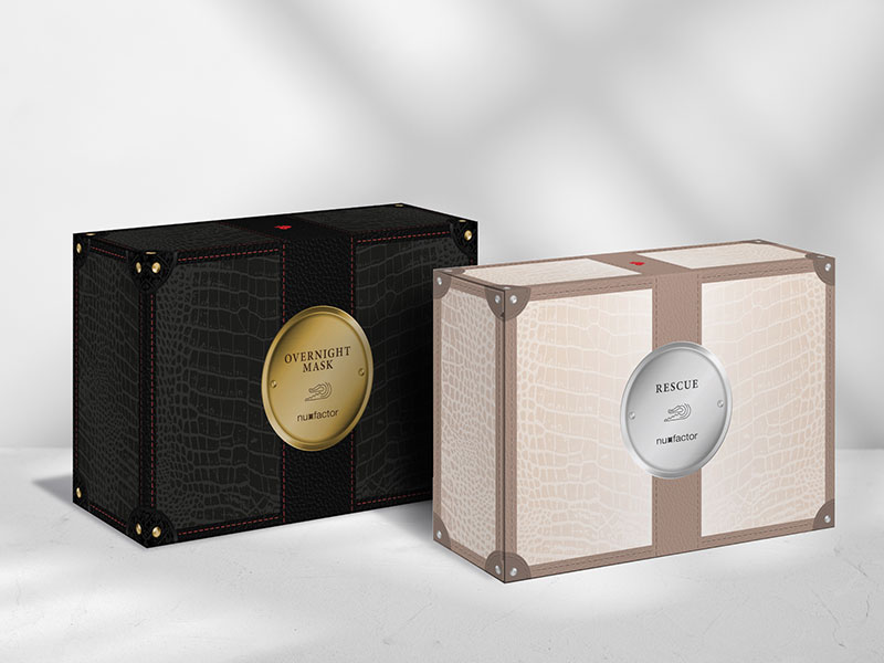
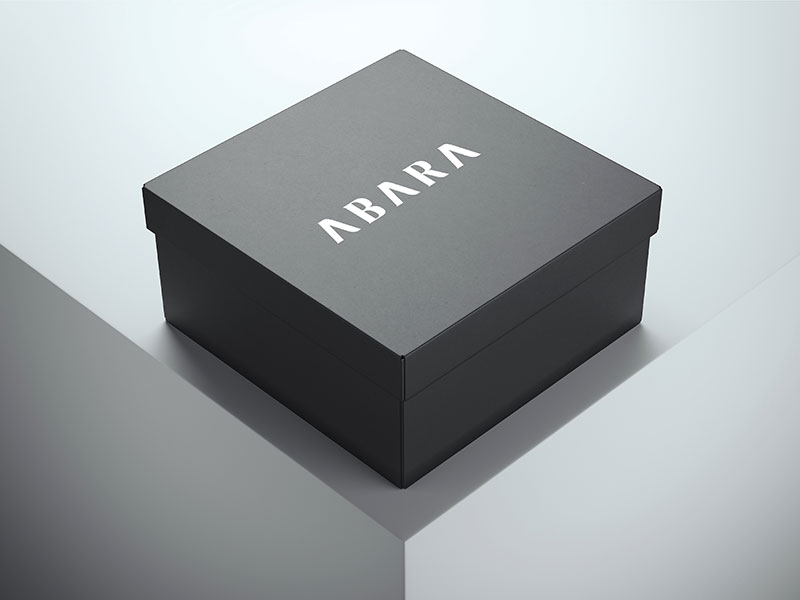
fashion packaging design: Abara
Abara, an emerging crocodile leather bag company, approached us to create their bag box packaging, to aid in their foray into the luxury bag scene. To allow their product to shine through, we opted for a simple black box, applying their logo in gold finishing prominently across the cover. This simple yet elegant treatment gives a delightfully exquisite feel, framing the product beautifully, yet not overpowering it.
powder detergent packaging design: Topload Spin
As a part of UIC corporation, Spin is a well know detergent brand in Singapore market. Bring out a totally new look for the brand, we apprise using metallic background while maintain the distinct spinning arrow. New features of Spin are introduced by using icon system at the bottom, helps consumer quickly understand the products.

dish wash liquid packaging design: UIC Big Value packages
UIC corporation is one of the iconic manufacture of powder detergent in Singapore and Malaysia. As UIC introduce a new transparent packaging, transparent container which effectively expose their product, we help UIC by refreshing their label. The new design showing clean and sparkling kitchenware, demonstrating the product wide range of usage. As UIC is a green and eco friendly product, the background use various green leafs, create depth and lively feeling.


tissue packaging design: NTUC Chinese New Year Tissue Pack
NTUC embodies over thirty decades to embrace Singapore’s living experience. With a great great selection of products, each in-house brand from NTUC has a unique character. Incorporate with Orient Design, we continuously invest in understanding each category and maximise the product reliability and impression.

tissue packaging design: MOOD facial tissue packages
Under the trusted brand Beautex, Mood tissue approaching the market with a brand new perspective. Targeting general market from office environment to family customer, the design demand an elegant look, test neutral and friendly. To differentiate from ordinary market which mostly using flowers, we come up with a new solution, the key visuals are various kinds of green leafs. The solution maintain the green and fresh feeling, yet widen the consumer scale.

infant product packaging design: Pigeon infant care
is an established brand for mother and infant care products. We combined the elements of practical functionality with aesthetics, to achieve an adaptable and flexible design for Pigeon. The new and improved packaging is a see-through box with adjustable dividers. The design proved to be very cost-effective, as it significantly reduced inventory and printing costs for Pigeon.


tobacco packaging design: Various Brand
Packaging design for diverse potential regional market, capturing various target consumer with different key visual mood.

bulb packaging design: IsunU light bulb
Introducing IsunU, a new player in energy saving light bulb from German, by studying and understanding the market, Orient Design resolved to capture the product from an uncommon angle. By photograph the bulb at low view, we present IsunU unique ventilation feature which help cool down the bulb and expand it usage.

automotive belt packaging design: Autowérk automotive parts
Autowek is a supplier of automotive parts. Although its products are of good quality, they were underperforming in terms of sales. This was due to its weak packaging, which failed to instil consumer confidence. We added quality-assurance labels to help establish the credibility of Autowérk’s products. Additionally, we made their products more eye-catching by using a contrasting combination of green and black for the packaging.

industrial packaging design: Gates automotive parts
Gates is one of market leader in manufacturing timing belt from Japan. By carefully study and character of the brand industry and a the huge product range, we understand Gates demand a graphic system supporting them to categorize products. Blue and Green help distinctive two category line. As the product will be stored on shelf and expose the side, we use a label system with increased font and number size at the bottom to help our customer easily pick the one they need. This design decreases inventory cost and improve flexibility in labeling for Gates.
